
Khalil Dodo
Product & UX Designer
Khalil Dodo
Product & UX Designer
Khalil Dodo
Product & UX Designer
Zippa Travels Platform
Zippa Travels Platform
Mobile App
Mobile App
Web App
Web App
Hospitality & Travels
Hospitality & Travels
2023 - 2024
2023 - 2024
Designing an app for the part of travel nobody enjoys. The booking.
Designing an app for the part of travel nobody enjoys. The booking.

OVERVIEW
OVERVIEW
Zippa Travels needed one app to handle two very different jobs: booking flights and booking hotels, plus a third, quieter one: helping people manage what they'd already booked, without the anxiety that usually comes with trips. As sole UI Designer, I shaped how all three lived together as one coherent product.
Zippa Travels needed one app to handle two very different jobs: booking flights and booking hotels, plus a third, quieter one: helping people manage what they'd already booked, without the anxiety that usually comes with trips. As sole UI Designer, I shaped how all three lived together as one coherent product.
MY ROLE
MY ROLE
Product Designer
Product Designer
THE CHALLENGE
THE CHALLENGE
Flight and hotel booking are two different mental modes wearing the same "travel app" label. Booking a flight is urgent and comparison-heavy; dates, times, layovers, price swings. Booking a hotel is slower and more visual; location, photos, amenities, reviews. Most travel apps handle this by making one of the two feel like an afterthought bolted onto the other.
On top of that, Zippa had a third job most competitors treat as secondary: once something's booked, people don't stop needing the app, they also need to check in, change a date, find a confirmation, or just calm down and confirm "yes, this is definitely still happening." That moment needed just as much design attention as the booking flow itself, even though it's less exciting to design for.
Flight and hotel booking are two different mental modes wearing the same "travel app" label. Booking a flight is urgent and comparison-heavy; dates, times, layovers, price swings. Booking a hotel is slower and more visual; location, photos, amenities, reviews. Most travel apps handle this by making one of the two feel like an afterthought bolted onto the other.
On top of that, Zippa had a third job most competitors treat as secondary: once something's booked, people don't stop needing the app, they also need to check in, change a date, find a confirmation, or just calm down and confirm "yes, this is definitely still happening." That moment needed just as much design attention as the booking flow itself, even though it's less exciting to design for.
THE DIRECTION
THE DIRECTION
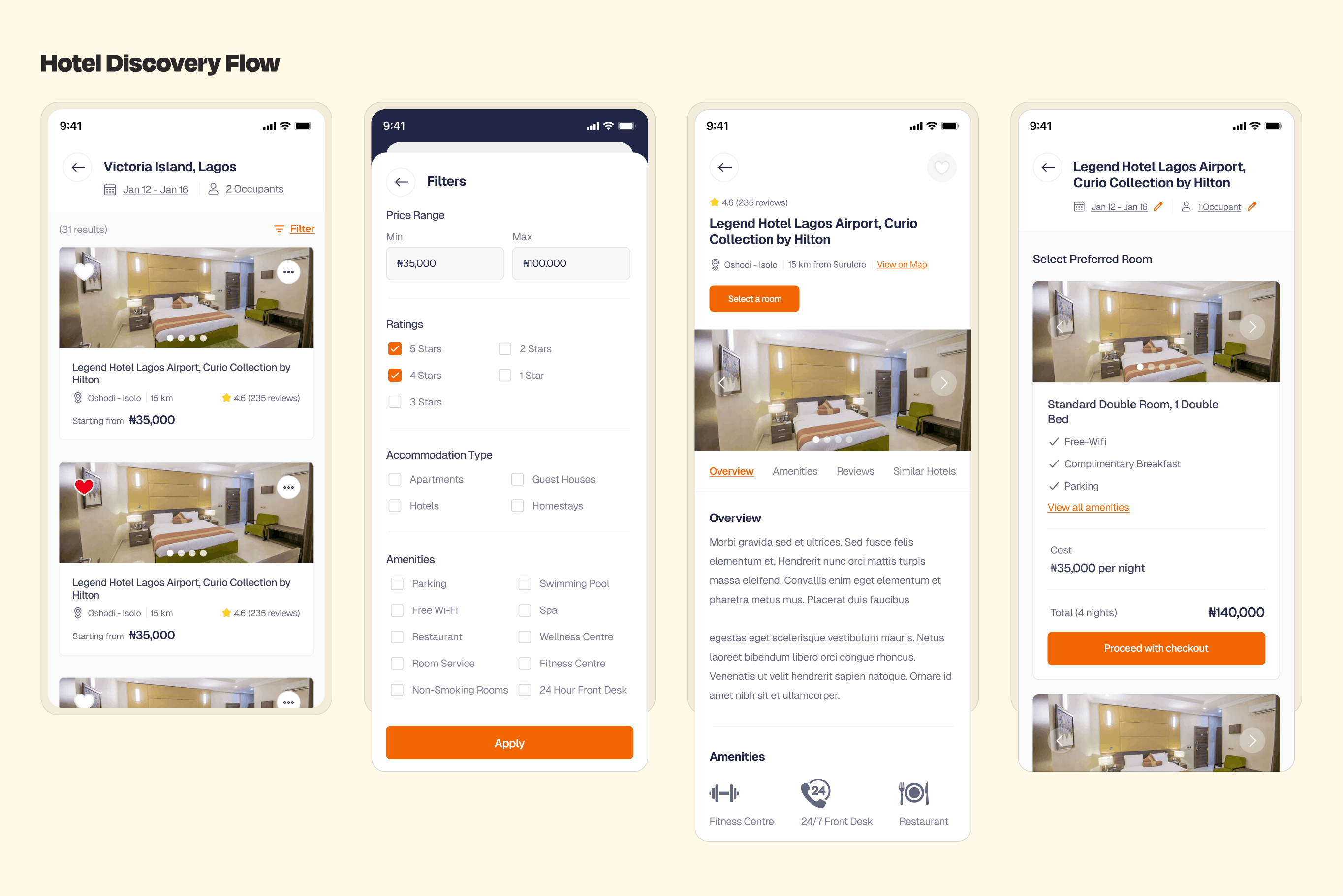
The idea that shaped the whole app: treat flights, hotels, and bookings as three distinct modes with one shared visual language, rather than three features crammed into a single generic flow. Each area got its own rhythm suited to how people actually think in that context fast and comparison-first for flights, visual and exploratory for hotels, calm and reassuring for managing what's already booked while sharing the same navigation, typography, and component system so it never felt like three separate apps stitched together.
The idea that shaped the whole app: treat flights, hotels, and bookings as three distinct modes with one shared visual language, rather than three features crammed into a single generic flow. Each area got its own rhythm suited to how people actually think in that context fast and comparison-first for flights, visual and exploratory for hotels, calm and reassuring for managing what's already booked while sharing the same navigation, typography, and component system so it never felt like three separate apps stitched together.
THE SCREENS
THE SCREENS
Here's what it actually looks like
Here's what it actually looks like



Thank you for reading!
Thank you for reading!
Thank you for reading!
Other Projects
Other Projects
Other Projects

